Using Storybook to Develop React Components Faster

When your goal as a product developer is to ship things faster, it’s a constant process of adding things that work and removing things that don’t. You need to try new processes that enable you to complete your work faster.
So what tools can you add to your workflow to supercharge development in React? Storybook.
What is Storybook?
Storybook is, according to its website, an “open-source platform that allows you to document, view, and test many permutations of your JavaScript components within an isolated environment.”
Before I start to create a component, I first create stories for it in Storybook, then I start integrating it into my React app. This leads to writing more code, but leads me to reduce my churn.
It also forces me to think about edge cases, how the API of a component should be defined, and to decouple it from my main application.
It's similar to Test-driven Development: write out the test cases before the code is written, but in this case, the tests are stories of all the states a component can be in. Being its own app, iterating through component designs is quick. Storybook has led to me ironing out edge cases, catching more bugs, and ultimately, finishing features faster.
Integrating Storybook with visual testing services like Percy can help your team move fast with each pull request showing you diffs of new component changes. You can also further test components that are API-driven by mocking out query responses with Mock Service Worker.
Setting up components in Storybook
Let's go through an example of how to get features done quicker using Storybook. Stories are just components rendered with a particular set of props. You can have as many or few as you like.
Let's pretend we are building a blog and want to have a list of entries on the index page. Let's make a story for each state of the component which will render each entry.
import React from "react";

import { BlogEntryListItem } from "./BlogEntryListItem";

export default {
  title: "BlogEntryListItem",
  component: BlogEntryListItem,
};

export const BlogEntryListItemLoaded = () => (
  <BlogEntryListItem
    title={"A Fake Blog Post Title"}
    excerpt={"Lorem Khaled Ipsum is a major key to success."}
    date={"2019-01-01"}
    lastUpdatedAt={"2020-01-02"}
    slug={"/a-fake-blog-post-title"}
  />
);

export const BlogEntryListItemLongExcerpt = () => (
  <BlogEntryListItem
    title={"A Fake Blog Post Title"}
    excerpt={
      "Lorem Khaled Ipsum is a major key to success. You should never complain, complaining is a weak emotion, you got life, we breathing, we blessed. The key to success is to be yourself."
    }
    date={"2019-01-01"}
    lastUpdatedAt={"2020-01-02"}
    slug={"/a-fake-blog-post-title"}
  />
);

export const BlogEntryListItemLoading = () => <BlogEntryListItem loading />;
We focus on the API of the component before coding the real thing. I like to mirror product requirements here.
In this example, I knew some blog entry excerpts would be long, so I created a story for it. I also needed to have a loading state because I planned to use react-loading-skeleton.
The next step is creating the basic code for the component:
import React from "react";

export const BlogEntryListItem = (props) => {
  if (props.loading) {
    return <div>Loading...</div>;
  }
  return (
    <NoColorLink to={props.slug}>
      <BlogListItemWrapper>
        <Description>
          <Title>{props.title}</Title>
          <span>
            Published: {props.date}
            <br />
            Last Updated: {props.lastUpdatedAt}
          </span>
          <Excerpt>{props.excerpt}</Excerpt>
        </Description>
      </BlogListItemWrapper>
    </NoColorLink>
  );
};
Here’s what it looks like in Storybook:
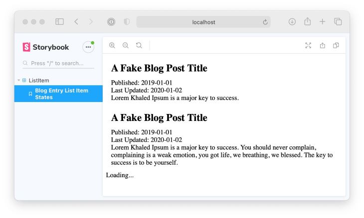
The great thing about this is that we haven't touched our main application at all. We didn't have to muck around with production configuration, environment variables, or running local API services.
Improving components with Storybook
Defining all the states the component needs and writing a simple implementation has us looking great so far!
Without adding our
BlogEntryListItemcomponent to to the main application, we can start making improvements right away. As you probably noticed, the excerpt is quite long and wraps the inside the<div>, so let's fix that usingoverflow: hidden.
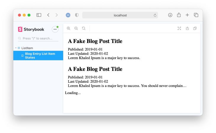
Look! We improved our component without even stepping foot into our main app. We can go even further using some add-ons that ensure our component is even more capable.
One of the add-ons that Storybook comes with by default is Storybook Viewport Addon, which allows you to see what your components look like on various screen sizes.
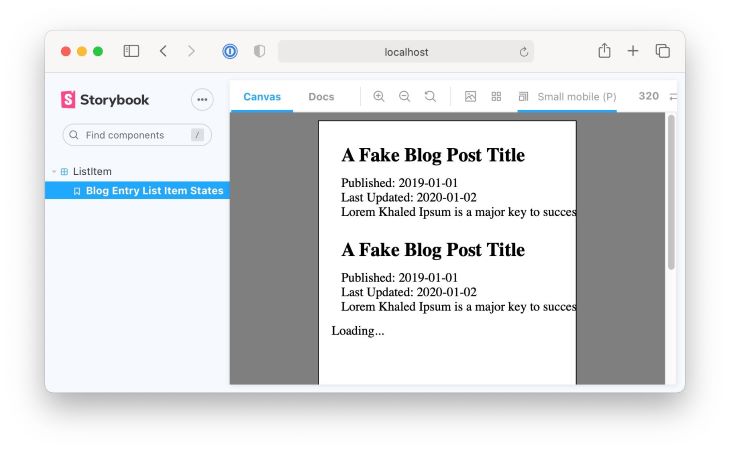
Using this add-on in this example shows us that we can’t read excerpts on mobile.
You can see how using Storybook can improve our components without ever needing to run our main React application. This is the true power of working with components.
Improving speed with Storybook
When iterating through components, many visual changes are bound to happen. Having a coworker pull your code changes and run Storybook locally to see changes works is slow, and we can certainly work faster.
Visual Testing tools give you screenshots of the visual diff between components as you iterate. For example, a tool can generate a screenshot of a fix for our component to properly render entries on mobile.
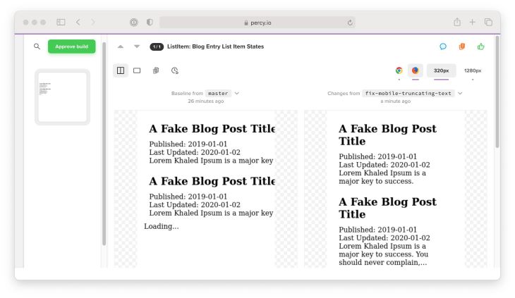
This works through a Continuous Integration service like CircleCI or Github Actions, you can build Storybook and use the Percy Storybook plugin to snapshot all of your stories. It renders every story in a consistent browser environment and sends the HTML over to Percy for it to render. It then compares these rendered stories to previous builds to mark differences, like this:
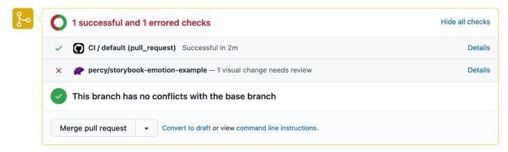
Percy provides a great Github Action, which does all of this automatically. Here is an example pull request which implements this.
In my experience, using visual testing with Storybook has caught many regressions by spotting changes which we didn't catch in code review.
Mocking out API queries with Storybook
Not only can Storybook provide us with a way to test components’ look and feel, but it can also can help us test behavior. Some components in your application most likely query data from a remote API. These are most often called "container components" or "page components.”
Providing fake data for your components is great, but we can get closer to reality by mocking the API requests that the components perform.
This example uses a REST API but the libraries used are compatible with GraphQL.
Thinking back to our blog entries, typically a parent component would query for a bunch of entries:
import React from "react";
import { useQuery } from "react-query";

import { BlogEntryListItem } from "./BlogEntryListItem";

async function fetchBlogEntries() {
  const res = await fetch("<https://fake-blog-entries-url.com>");
  if (!res.ok) {
    throw new Error(res.statusText);
  }
  const data = await res.json();
  return data.results;
}

export const BlogEntries = (props) => {
  const { status, data, error } = useQuery("blog-entries", fetchBlogEntries);
  return data.map((datum, index) => {
    return <BlogEntryListItem key={index.toString()} {...datum} />;
  });
};
It would be nice if we could mock a response from the server in Storybook to see how the component behaves in different scenarios. There is a great library called Mock Service Worker that will intercept browser network queries and provide mock responses. Coupled with the Storybook add-on for this module, we can provide mock data:
import React from "react";
import { QueryClient, QueryClientProvider } from "react-query";
import { rest } from "msw";
import { BlogEntries } from "./BlogEntries";
const mockedQueryClient = new QueryClient({
defaultOptions: {
queries: {
retry: false,
},
},
});
export default {
title: "BlogEntries",
component: BlogEntries,
};
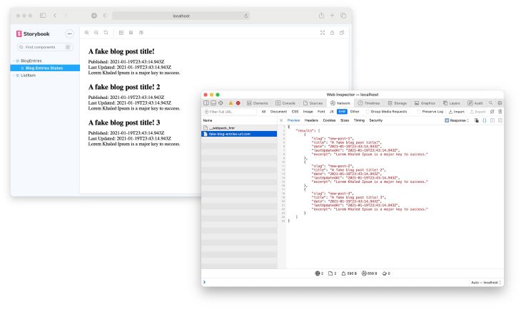
export const BlogEntriesStates = () => (
<QueryClientProvider client={mockedQueryClient}>
<BlogEntries />
</QueryClientProvider>
);
BlogEntriesStates.story = {
parameters: {
msw: [
rest.get("<https://fake-blog-entries-url.com>", (req, res, ctx) => {
return res(
ctx.json({
results: [
...
],
})
);
}),
],
},
};
Conclusion
I covered a lot here, so I'll summarize my Storybook workflow:
- Receive requirements from product
- Think about my component hierarchy
- For each component, write a story for each significant state
- For each "page" or feature, write a story and add API mocks
- Write the code for each component which satisfy each state
- Use Visual Testing in CI to test my changes against the main branch
Notice that there are many steps, and it can take some time to adapt to this new flow. But after practicing this workflow, it seems natural to me now and I would never go back to writing React code without using Storybook alongside me.
Storybook is a perfect way to prototype components and make sure visual components get the love they deserve.